
Creative Director Sally Storey talks us through a stunning project – lighting an open plan barn folly in the heart of London.
This is a very unique new build London project with interiors by Emily Todhunter of Todhunter Earle and architecture by Alex Flower at Flower Michelin Architects. The brief for the project and the styling was to feel contemporary, yet very warm and inviting, to give this open plan home a modern country feel.
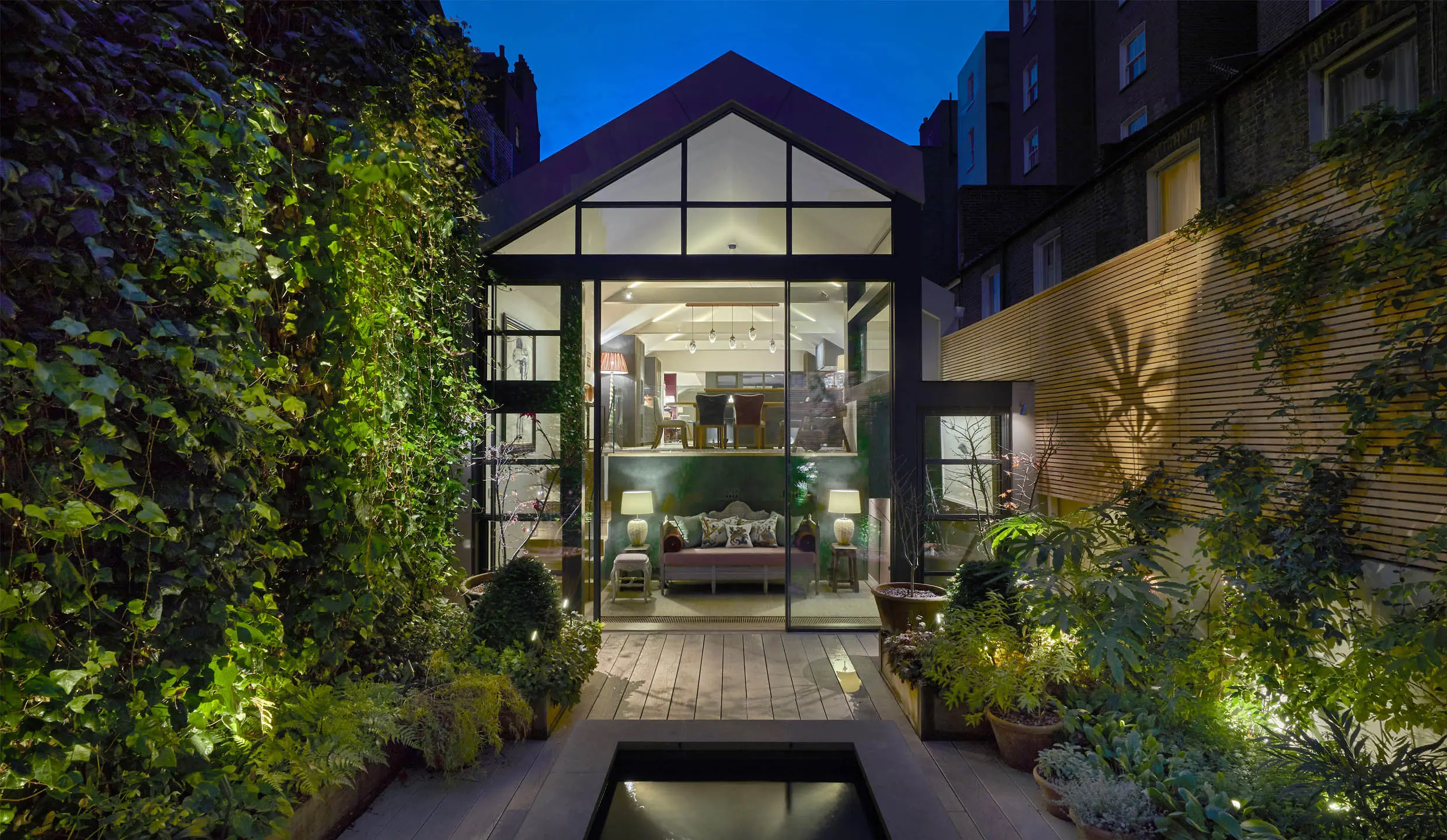
Upon arrival you come through a doorway into a pitched hallway with panelling painted in a dark steel grey and at that point you have no idea what lays beyond. Then as you walk in you see the vision; a huge open plan living space right you can see right through to the garden beyond. The idea of the lighting is to help separate this vast open plan space into different rooms, but at the same time reveal it as one.
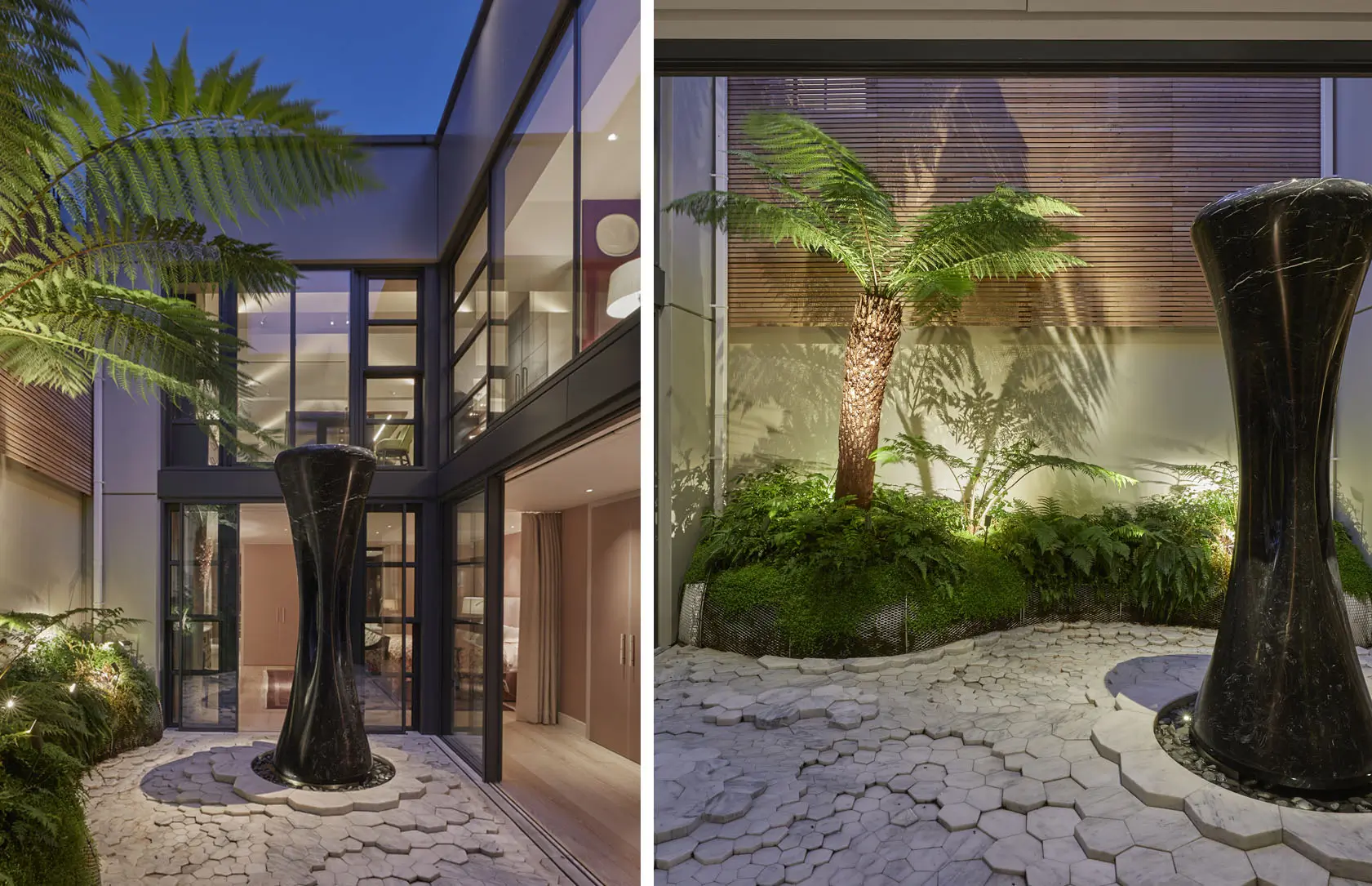
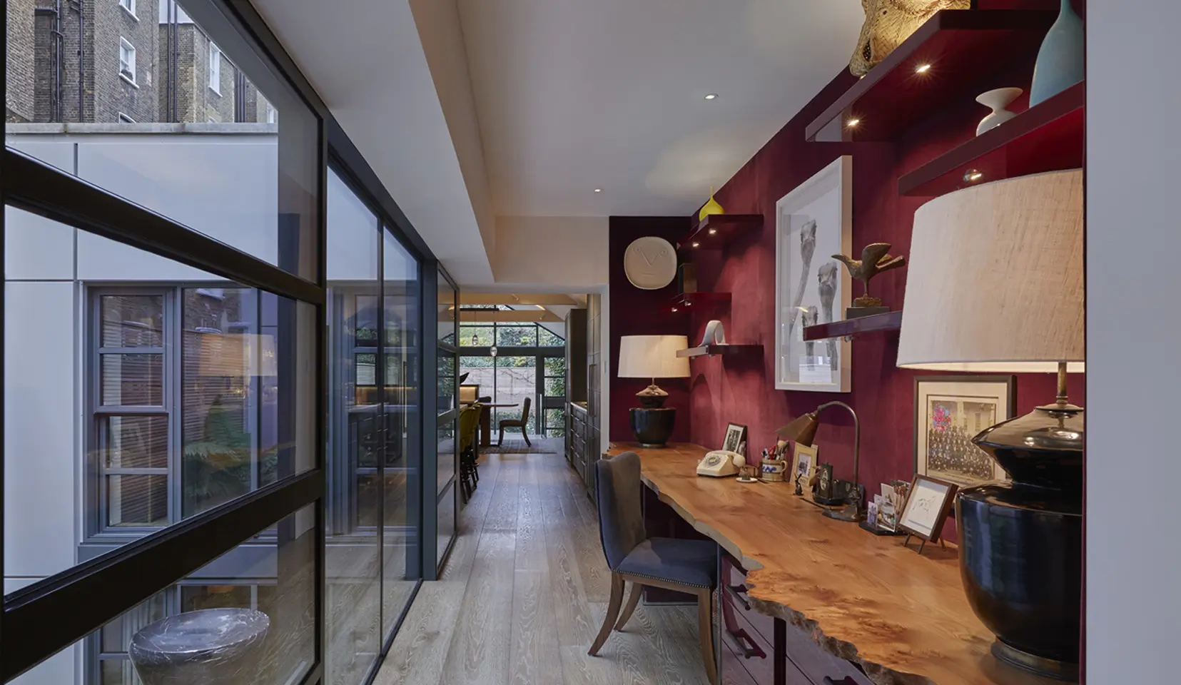
In order to give even more natural light to the space there was a central courtyard that separates the main living area with an adjoining study to the kitchen and dining room beyond. It creates a visual focus by day and extra drama with the uniquely lit courtyard at night. Transparency between inside and outside are very much a theme both during the day and night. An amazing sculpture/water feature by Jordi Raga gives a central focus to the space. It is uplit and spot lit from the roof level to further add to the drama.

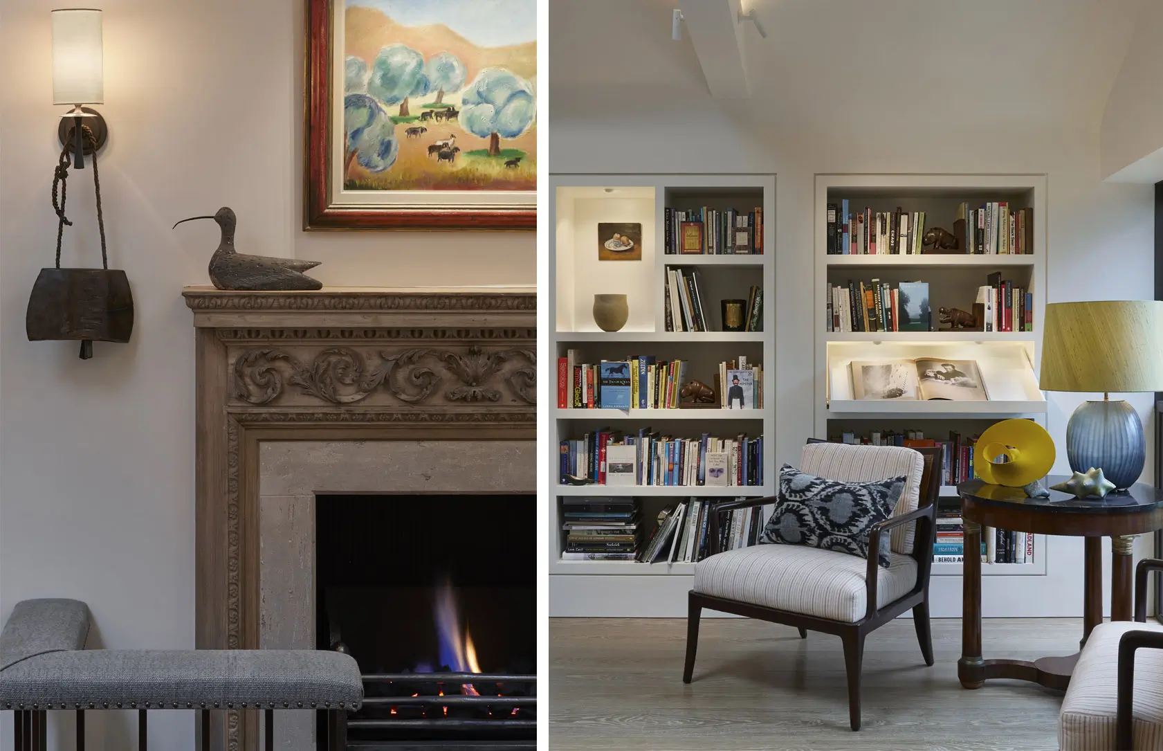
The main living room has a pitched ceiling with skylights. In order to emphasise the pitch we use a warm Contour LED strip to give a soft background uplight, and on either side of the beams we use our Vorsa Port spotlight. From the start the client wanted a flexible solution for the artwork but weren’t sure that they wanted to have spotlights mounted on each of the beams or just some of them. The Vorsa Port fittings give us the flexibility as the mounts either side of the beam can be selected according to the artwork being lit.
In the centre of the space Vorsa Ports create a focus on the coffee table. In the main living room we also wanted to introduce lighting into the bookcases. The idea of lighting the whole length of the bookcase would have been overpowering, so instead niches were created for specific sculptural items which are lit individually. In addition Vorsa’s again provide more general light across the front of the books.

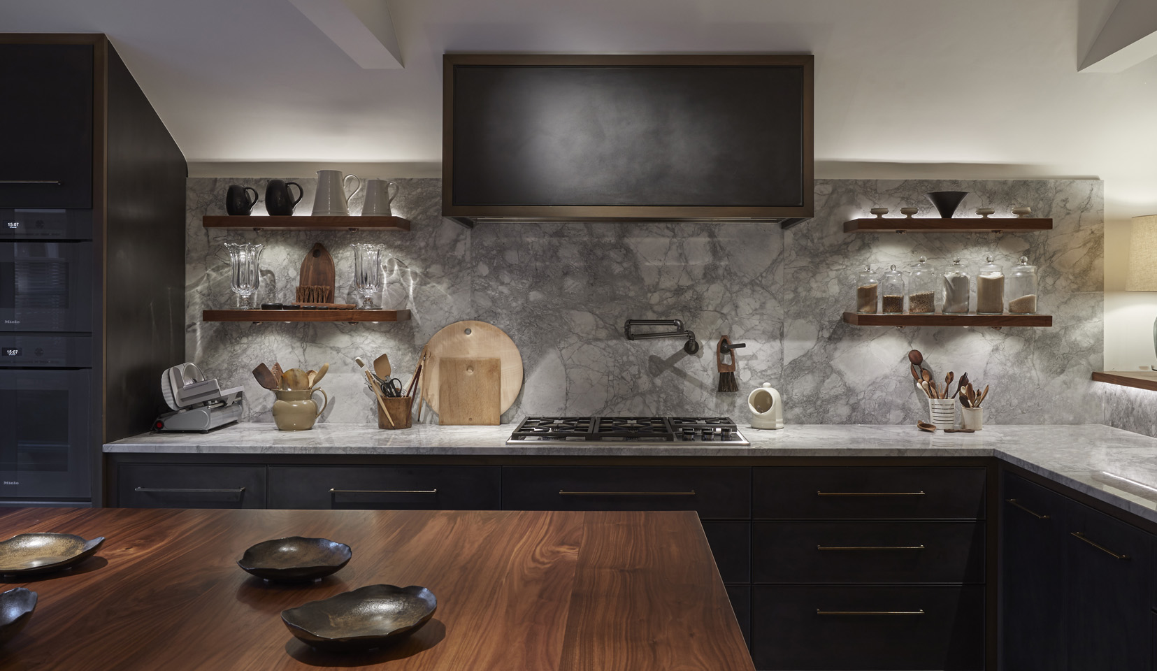
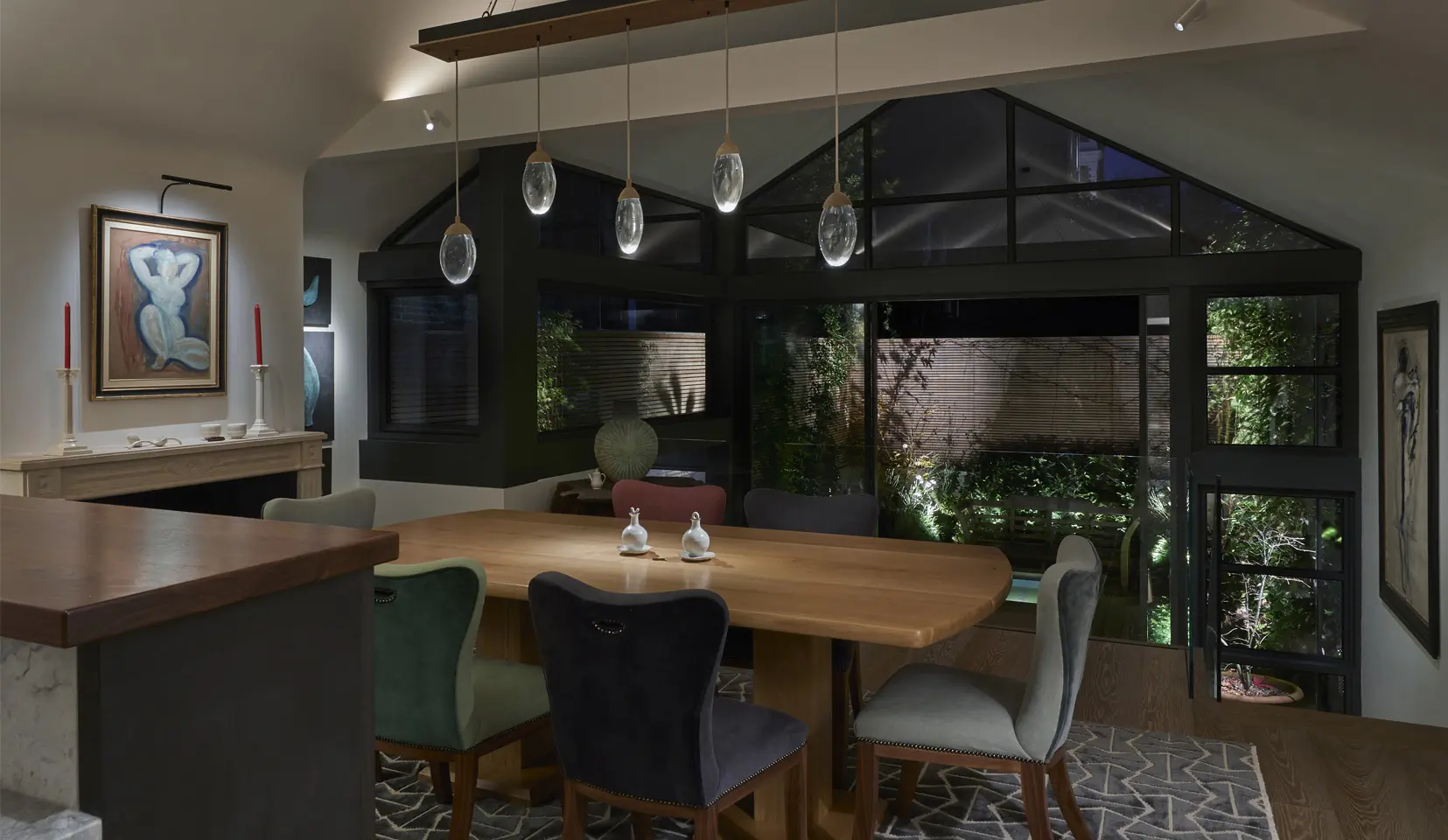
The open plan living space comprises a study linking through from the main living room to the kitchen and dining area. The pitched ceiling continues throughout, so once again the soft background ambient light is created with a Contour above the beams in the dining area. Vorsa Port’s provide focus over the kitchen island and surfaces. We also combine the use of decorative table lamps on the kitchen peninsula to give it a softer feeling and make it feel less like a kitchen. Instead of heavy cabinets above the work surface, shelves were mounted on this fabulous marble wall and lit with the small Etta Eyelid under cupboard lights to give a soft glow on the marble. Above the shelves, the Contour is concealed to back light the objects.

What was very important in this project is the combination of comfortable, more modern pieces combined with a wonderful art collection and decorative element of light, like the wonderful Ochre pendants over the dining table. These were supplemented by the narrow beam Vorsa Port 40s that provided a narrow pool of light to the centre.
By lighting the garden, our eyes are drawn beyond creating the extension of space. Any fully glazed space will feel like a mirror and black at night and we wanted to avoid this. The whole of the back of the house was crittall, with vast sliding glass doors to the wonderful garden designed by Tania Compton. When lit, the garden creates a feeling of space and gives a tonal dimension of inside/outside.

To keep the circulation and a continuous flow in the property, there is a staircase at the entrance that brings you through to a study area and guest bedroom. This links to the master suite and all surrounds by the central courtyard to keep an internal flow. By focusing light from above onto the stairs, it reflects light off the light cream stairs, and creates a light and airy feel. Sometimes it’s the simplest solutions that work best and you don’t need to light individual steps.

Lighting for this amazing space enhances the wonderful interiors and architecture discreetly lighting during the day and emphasises the eclectic collection of art and sculpture. At night the lighting links the open plan living spaces and provides a comfortable and inviting atmosphere for the clients to enjoy.
Interior Design: Todhunter Earle
Architect: Flower Michelin
Garden Design: Tania Compton
Photography: Ray Main
Discover the products behind the project
Be inspired by more global projects
An error has occurred, please try again later.An error has occurred, please try again later.
This website uses cookies so that we can provide you with the best user experience possible. Cookie information is stored in your browser and performs functions such as recognising you when you return to our website and helping our team to understand which sections of the website you find most interesting and useful.
Strictly Necessary Cookie should be enabled at all times so that we can save your preferences for cookie settings.
If you disable this cookie, we will not be able to save your preferences. This means that every time you visit this website you will need to enable or disable cookies again.


