As the Evening Standard announced the winners of their New Homes Awards 2017 last week, we thought you would like to see inside the Best Luxury Home winner which we have lit.
Langdale House, Roehampton Gate is located on a precious plot bordering Richmond Park. Local developer, Richstone Properties, created one large home of 8,500sq ft over four levels, with terrific lateral spaces to suit modern family lifestyles. The standout feature is a 1,000sq ft open-plan kitchen/dining/living space with a wall of glass that invites the garden in. Bespoke finishes include an elliptical walnut staircase, a hand-built, temperature-controlled wooden wine cellar and a lighting scheme designed by Sally Storey and Hazel Park.
We asked our Creative Director, Sally Storey, to walk you through this über-luxurious project and advise on how to achieve a similar effect in your home.
In this project, lighting has added a wow factor to the scheme. It can be transformed at the touch of a button to change the mood and atmosphere and suit the client’s requirements. Forget grids of LED downlights, they make a building look more like an office. Consider downlights that conceal the light source and combine them with uplights and floor washers for a magical solution.
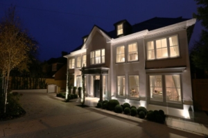
First impressions count, so begin by lighting the front door, and if the house is set back, light it through a soft wash of light over the façade. Here in this property, the John Cullen Lucca 40 throws a soft wash over the façade, and the miniature Lucca 30 uplights the columns at the entrance porch.
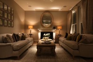
The formal sitting room on the ground floor has minimal downlights as the softness is provided by table lamps. The key is to create a focus in the centre of the room by lighting the coffee table with two discreet LED Polespring downlights with narrow beams. Also consider adding drama around the fireplace using the 1w Lucca uplights set into the hearth. This ensures the fireplace remains a centre piece even when the fire is not lit. It is important not to create a blanket illumination but rather to focus on room’s main features. This is what you need to remember when thinking about creating mood in your space.
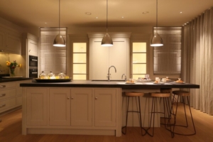
The huge open plan family room leading out to the garden is a clear winner, with the kitchen, dining room and sitting room being three rooms combined into one. The lighting becomes the divider, demarcating the three different rooms. In the kitchen zone, the three pendants create a visual screen, but what is important is the integrated warm contour HD24 LED strip in the cabinets and the Lucca lighting up the blinds in the windows. Layering of lighting effects is the key to a successfully lit interior.
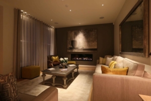
At the opposite end of the open plan living space, the lighting is controlled separately to ensure that the mood can be changed across the different areas. To achieve this good circuiting becomes all important in open plan spaces. The central focuses of each need to be kept separate so that the emphasis can be changed as each part becomes the part you are in.
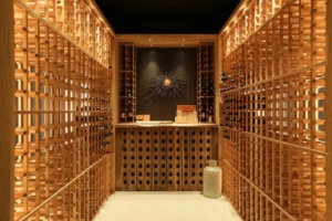
Wine cellars, gyms and cinema rooms are the perfect use of a basement area. The wine cellar, if lit well, can feel like a window in the basement, creating a focus, as can the gym, making the spaces flow together, compensating for a lack of natural light.
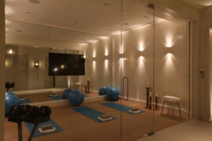
A gym should always combine both direct downlights and indirect for mat work. Here, the indirect light is provided by the Square up/downlights.
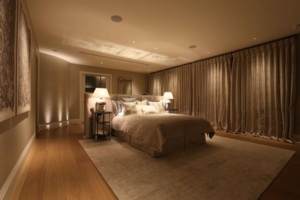
Good lighting can add impact to the bedroom. The background lighting should always be layered, but highlights to the headboard or the throw at the end of the bed create a focus in a similar way to the coffee table in the living room. Highlighting the curtains can also create a feeling of space in the evening.
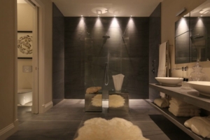
In the bathroom, it is key to light the finishes. These can be made to feel more luxurious using good lighting. Marble can look more luxurious and even simple tiles can be made to look glamorous. A master bathroom should be practical and bright in the morning but take on a spa-like feel at night. This can be created by light scanning down the back wall of tiles – again avoiding grids of downlights. Add a focus with a narrow beam on the basin, layering the lighting with Lucca uplights and lighting niches. Low level Cazalla floor washers set into the skirting are ideal as a nightlight if linked on a presence detector.
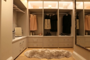
The walk-in wardrobe is another huge selling point. To save money, avoid adding doors but instead internally light the cupboards. These, together with miniature downlights, will light the space.
Lighting can be used to highlight key elements. It sets the tone and mood, adding atmosphere to your home. It is an understated secret.
3 ‘must-haves’ for creating the best luxury home lighting scheme:
1. Layering light so that it is not just up or downlights but a combination. Just as the interior designer plays with colour and texture, we play with lighting effects.
2. Having chosen the effects, controlling them independently makes all the difference so by manipulating each effect different moods can be achieved. At the very least all lights should be on a dimmer switch.
3. A beautifully decorative piece such as a chandelier or lamp that creates the look is essential. However they need to be supplemented by other effects so that it is enjoyed for itself rather than just being a light source.
If you are looking for more inspiration for your project, check out our project portfolio and room-specific lighting tips.
If you would like to talk to us about creating a bespoke lighting design for your property, please complete the form on our contact page or give us a call.